Buttons
Use buttons to trigger actions and links. Buttons should include text and can include an icon for support.
Best practices
Writing labels
- Ensure button labels are as short as possible while explaining what happens when the button is selected.
- Button labels should be no longer than three words.
- To help keep label length reasonable, consider adding descriptive copy prior to the action.
Do: Be clear and descriptive
Don't: Use ambiguous labels
- Always use sentence case and start with a verb wherever possible. Avoid title case and all caps.
Do: Use sentence case
Don't: Use title case or all caps
Button alignment
Buttons should be aligned depending on context:
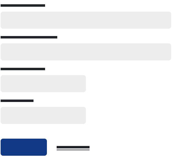
- For single page forms, left-align buttons and sort by importance from left to right.
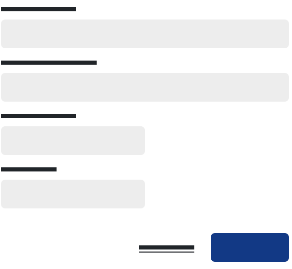
- When using buttons to help a user move through a series of stepped screens, right-align the primary button to visually support the intended direction.
- When using buttons in a warning, confirmation, or other modal context, right-align the primary button.
- Buttons may be placed to the right of single-input forms including forgot password and subscription sign up.

Do: Left align the primary button on single action forms

Do: Right align the primary button on multi-step forms
Button widths
- Buttons should be wide enough to accommodate the label while maintaining consistent label padding. Exceptions to this rule are block-level buttons and when buttons are stacked.
- Stacked buttons should always be the same width, regardless of the label.
Do: Ensure stacked buttons are the same width
Don't: Use varying widths when buttons are stacked
Primary button
Use this strong button to highlight primary actions on a screen, like the ‘submit’ button on a form, or other actions that are critical in a workflow or process. There should only be one primary button per screen but not every screen requires a primary button.
<button type="button" class="btn btn-primary">Primary</button>Secondary button
Use this standard button in most cases where a button is required and especially where there are likely to be multiple buttons on a screen and/or when a primary button isn’t required.
<button type="button" class="btn btn-secondary">Secondary</button>Secondary outline button
Use this outline button in isolation, for less prominent actions, or paired with a primary or secondary button. Use of a secondary outline button assumes that the screen already has a primary or secondary button.
<button type="button" class="btn btn-outline-secondary">Secondary outline</button>Tertiary button
Use this button for non-essential actions or where the styling of the secondary outline doesn’t work. This button should not be paired with the primary or secondary buttons.
<button type="button" class="btn btn-light">Tertiary</button>Link button
Use link buttons to navigate to another page or screen where a button is too strong or doesn’t fit. These buttons can also be used to represent the opposite action of a primary or secondary button, like ‘Cancel’ on a form or modal.
<button type="button" class="btn btn-link">Link</button>Button sizes
Use the default size in most cases. Use small buttons in tables and/or for supplemental actions. Use large buttons only on larger, isolated screens where a single element (like an image) dominates the viewport. Add .btn-lg or .btn-sm for these additional sizes.
<button type="button" class="btn btn-primary btn-lg">Large button</button>
<button type="button" class="btn btn-secondary btn-lg">Large button</button>

<button type="button" class="btn btn-primary btn-sm">Small button</button>
<button type="button" class="btn btn-secondary btn-sm">Small button</button>
Block buttons
A block-level button uses 100% of the available width of the container or parent element. A block-level button is used for visual prominence and is especially effective on mobile views. Create block level button by adding .btn-block.
<button type="button" class="btn btn-primary btn-lg btn-block">Block level button</button>
<button type="button" class="btn btn-secondary btn-lg btn-block">Block level button</button>
Buttons with icons
Add the class icon-link to your button or link to add icons to your buttons. Icons should only be used as support.
Do: Accompany icons with labels
Don't: Use icons without labels
An exception to the above is the search icon, which can be used on a button without a label when combined with a search field.
<button class="btn btn-sm btn-outline-secondary icon-link"><i class="far fa-edit" aria-hidden="true"></i>Edit profile</button>Button tags
The .btn classes are designed to be used with the <button> element. However, you can also use these classes on <a> or <input> elements (though some browsers may apply a slightly different rendering).
When using button classes on <a> elements that are used to trigger in-page functionality (like collapsing content), rather than linking to new pages or sections within the current page, these links should be given a role="button" to appropriately convey their purpose to assistive technologies such as screen readers.
<a class="btn btn-primary" href="#" role="button">Link</a>
<button class="btn btn-primary" type="submit">Button</button>
<input class="btn btn-primary" type="button" value="Input">
<input class="btn btn-primary" type="submit" value="Submit">
<input class="btn btn-primary" type="reset" value="Reset">
Active state
Buttons will appear pressed (with a darker background, and darker border) when active. There’s no need to add a class to <button>s as they use a pseudo-class. However, you can still force the same active appearance with .active (and include the aria-pressed="true" attribute) should you need to replicate the state programmatically.
Primary active Secondary active Secondary outline active Tertiary active Link active
<a href="#" class="btn btn-primary btn active" role="button" aria-pressed="true">Primary active</a>
<a href="#" class="btn btn-secondary btn active" role="button" aria-pressed="true">Secondary active</a>
<a href="#" class="btn btn-outline-secondary active" role="button" aria-pressed="true">Secondary outline active</a>
<a href="#" class="btn btn-light active" role="button" aria-pressed="true">Tertiary active</a>
<a href="#" class="btn btn-link active" role="button" aria-pressed="true">Link active</a>
Disabled state
Make buttons look inactive by adding the disabled boolean attribute to any <button> element.
<button type="button" class="btn btn-primary" disabled>Primary disabled</button>
<button type="button" class="btn btn-secondary" disabled>Secondary disabled</button>
<button type="button" class="btn btn-outline-secondary" disabled>Secondary outline disabled</button>
<button type="button" class="btn btn-light" disabled>Tertiary disabled</button>
<button type="button" class="btn btn-link" disabled>Link disabled</button>
Disabled buttons using the <a> element behave a bit different:
<a>s don’t support thedisabledattribute, so you must add the.disabledclass to make it visually appear disabled.- Some future-friendly styles are included to disable all
pointer-eventson anchor buttons. In browsers which support that property, you won’t see the disabled cursor at all. - Disabled buttons should include the
aria-disabled="true"attribute to indicate the state of the element to assistive technologies.
<a href="#" class="btn btn-primary btn-lg disabled" tabindex="-1" role="button" aria-disabled="true">Primary link</a>
<a href="#" class="btn btn-secondary btn-lg disabled" tabindex="-1" role="button" aria-disabled="true">Link</a>
Link functionality caveat
The .disabled class uses pointer-events: none to try to disable the link functionality of <a>s, but that CSS property is not yet standardized. In addition, even in browsers that do support pointer-events: none, keyboard navigation remains unaffected, meaning that sighted keyboard users and users of assistive technologies will still be able to activate these links. So to be safe, add a tabindex="-1" attribute on these links (to prevent them from receiving keyboard focus) and use custom JavaScript to disable their functionality.